Signal vs. Noise: Why the Best Shopify Stores Do Less
The bike shed problem
In 1957, the British historian C. Northcote Parkinson described a peculiar pattern. A committee tasked with approving a £10 million nuclear power plant breezes through the decision in minutes — the stakes are so high and the topic so complex that nobody feels qualified to challenge it. Then the same committee spends 45 minutes debating the color of a £350 bike shed. Everyone has an opinion about bike sheds.
Parkinson called this the Law of Triviality: the time spent discussing something is inversely proportional to its importance.
If you’ve ever run a Shopify store — or worked with merchants who do — you’ve watched this happen in real time.
The pattern we see every day
We work with hundreds of Shopify stores at SmartSize. After years of this, a pattern has emerged that’s almost comically consistent:
The stores that sell the most ask for the least.
Our biggest merchants — the ones processing thousands of orders a month — install SmartSize, configure the basics, and move on. They take things out of the box. They don’t agonize over whether the button should be 2 pixels wider or the font weight should be 500 instead of 600. They ship, they measure, they iterate on what matters.
Then there are the stores that haven’t sold a single t-shirt yet. These are the ones that send us 47 support tickets about the exact hex code of a border, request custom animations for the quiz transition, and ask if we can make the loading spinner rotate counterclockwise. They’ve installed 35 apps. Their store loads in 9 seconds. Their checkout has four pop-ups. And they haven’t made a sale.
This isn’t a judgment. It’s a diagnosis. These stores are drowning in noise and can’t hear the signal.
Signal and noise: a framework for what matters
In statistics, signal is the meaningful pattern in a dataset — the truth you’re trying to find. Noise is everything else: the randomness, the interference, the static that obscures the pattern.
Nate Silver wrote an entire book about this — The Signal and the Noise — arguing that the explosion of data in the modern world hasn’t made us better decision-makers. It’s made us worse. More data means more noise. And more noise means more opportunities to mistake random patterns for meaningful ones.
The same principle applies to running an online store. Every new Shopify app is a data point. Every design tweak is a data point. Every A/B test on a button color is a data point. But most of them are noise. They don’t move the needle. They just make the dashboard more complicated.
The signal for a new Shopify store is brutally simple:
- Do you have a product people want?
- Can they find it?
- Can they trust you enough to buy it?
- Can they check out without friction?
That’s it. Everything else is noise — at least until you’ve answered those four questions with consistent sales.
The 80/20 rule — and its uncomfortable cousin
Most people know the Pareto Principle: roughly 80% of your results come from 20% of your efforts. In e-commerce, this usually means a small fraction of your products drive most of your revenue, a handful of marketing channels bring most of your traffic, and a few key pages determine whether people buy or leave.
But there’s a less comfortable version of this principle: 80% of what you’re doing right now probably doesn’t matter.
That app you spent three hours configuring? Noise. That custom font you imported from a designer in Portugal? Noise. The 14 product badges you added because a YouTube guru said urgency sells? Noise.
The uncomfortable truth is that most optimization work on a new store is a form of productive procrastination — it feels like progress because you’re busy, but it doesn’t produce results because it’s aimed at the wrong layer of the problem.
You can’t A/B test your way to product-market fit. You can’t animate your way to trust. You can’t plugin your way to a first sale.
Via negativa: the power of subtraction
Nassim Nicholas Taleb introduces a concept in Antifragile that should be tattooed on the wall of every Shopify merchant’s office: via negativa.
The idea is ancient — rooted in theology — but the business application is direct: we know what’s wrong with far more clarity than what’s right. Therefore, improvement comes more reliably from removing bad things than from adding good ones.
Taleb argues that subtracting is more robust than adding because additions introduce hidden feedback loops and unintended consequences. Every app you install can conflict with another app. Every script slows your page. Every feature creates a new surface for confusion.
Subtraction, on the other hand, is clean. Remove an unnecessary pop-up and your page loads faster, your layout is clearer, and there’s one less thing competing for your customer’s attention. No hidden side effects.
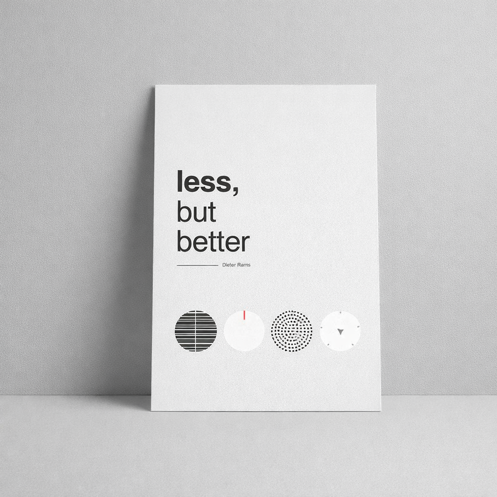
Antoine de Saint-Exupéry captured this perfectly in 1939: “Perfection is finally attained not when there is no longer anything to add, but when there is no longer anything to take away.”
Or as Dieter Rams, the legendary Braun designer whose principles shaped everything from the iPod to modern web design, put it more bluntly: “Less, but better.”
If you want to improve your store today, don’t ask “What should I add?” Ask: “What should I remove?”
The paradox of choice — applied to you, the merchant
Barry Schwartz’s The Paradox of Choice is usually referenced in the context of shoppers — give customers too many options and they freeze, abandon their cart, or buy nothing. A 2024 Accenture study found that 74% of shoppers abandoned purchases because they felt overwhelmed by choices.
But the paradox applies just as violently to the merchant.
Open the Shopify App Store. There are over 13,000 apps. Every category — email, reviews, upsells, bundles, SEO, analytics, loyalty, size charts, pop-ups, exit intent — has dozens of competing options. Each one promises a conversion lift. Each one has a compelling demo.
This is the paradox of choice turned inward. Instead of choosing which product to buy, you’re choosing which tool to install. Instead of deciding between sizes, you’re deciding between plugins. And the result is the same: decision fatigue, anxiety, and a store cluttered with tools that collectively produce less than any single one would alone.
The most successful merchants we work with have solved this by adopting a simple rule: install the minimum number of apps that address a proven problem. Not a hypothetical problem. Not a problem a blog post told them they’d have. A problem they’ve actually experienced, with real customers, backed by real data.
The AI rabbit hole
It’s 2026, and there’s a new flavor of noise: artificial intelligence.
AI tools are extraordinary. They can write your product descriptions, generate your ad copy, design your banners, analyze your analytics, build your email sequences, and optimize your pricing. The temptation is to plug AI into everything — to automate every corner of your business before you’ve validated the fundamentals.
But here’s the trap: AI amplifies whatever you point it at, including your distractions.
Using AI to write 200 product descriptions for a store with no traffic is noise. Using AI to generate 14 variations of a homepage banner when you haven’t nailed your value proposition is noise. Using AI to build a complex email funnel for a list of 12 people is noise.
AI doesn’t distinguish between signal and noise. It optimizes indiscriminately. If you aim it at the wrong problem, you’ll get a beautifully optimized wrong answer — faster than ever before.
The merchants who use AI well use it the same way they use apps: sparingly, on validated problems, after the fundamentals are working. They use it to scale what works, not to discover what works.
Why the biggest stores keep it simple
Here’s the counterintuitive pattern again: the stores with the highest revenue tend to have the simplest setups.
Why? Three reasons.
1. They’ve learned what doesn’t matter. Every successful store has been through the phase of installing too many apps, tweaking too many settings, and chasing too many small improvements. The difference is they came out the other side. They learned — through painful experience and wasted time — that most of it was noise. Now they protect their attention ruthlessly.
2. They value speed over perfection. Getting a product live with a decent page, a clear price, and a working checkout beats spending three weeks perfecting the page layout. Speed gives you data. Data tells you what to improve. Perfection without data is just guessing with extra steps.
3. They optimize for the customer, not for themselves. The most common reason merchants obsess over tiny details is that they notice them. But customers don’t. A shopper on your product page is not evaluating your typography. They’re asking one question: “Is this the right product, in the right size, at the right price, and can I trust this store?” If the answer is yes, they buy. If it’s no, no amount of micro-polish will save the sale.
Why we built SmartSize to be opinionated
This philosophy shapes how we build SmartSize.
We could offer 200 customization options — custom quiz layouts, drag-and-drop question builders, theme editors with 47 color pickers, bespoke animation curves. That’s what merchants think they want when they first install a sizing app.
But it’s not what they need. And it’s not what their customers need.
What a shopper needs is simple: confidence that they’re picking the right size, in under 30 seconds. Everything in SmartSize is designed around that single outcome.
So we made the product opinionated by design:
- The quiz flow is fixed because we’ve tested hundreds of variations and know which sequence produces the most accurate recommendations with the least friction.
- The visual fit map looks the same on every store because consistency builds trust — shoppers shouldn’t have to learn a new interface on every site.
- Language detection is automatic because no merchant should have to think about localization settings.
- The design is clean and neutral because it needs to work inside any Shopify theme, not fight with it.
We arrived at these decisions the same way the best stores arrive at theirs: by talking to thousands of customers, watching what actually moves the needle, and ruthlessly removing everything else. Not by adding options — by subtracting them.
The result is a product you can install and have working in five minutes. Not because it’s limited, but because the decisions have already been made — informed by data from thousands of stores and millions of shoppers.
Less, but better.
The one thing to do today
If you take one thing from this post, let it be this:
Stop customizing. Start trusting.
The apps you’ve installed were built by teams that spent months — sometimes years — researching, testing, and iterating on the defaults. Those defaults aren’t placeholders. They’re the distilled result of thousands of data points from stores that came before yours. When you override them with your gut feeling about what “looks better,” you’re usually replacing signal with noise.
The next time you’re about to spend an hour tweaking a setting, ask yourself: has a single customer ever complained about this? If the answer is no, leave it alone. Use that hour to talk to a customer, improve a product description, or figure out where your traffic is actually coming from.
The best stores don’t fight their tools. They let their tools do the heavy lifting — out of the box — and focus their energy on the things no app can do for them: building a great product and earning trust.
Stop painting the bike shed. Start selling.
— Philip, co-founder of SmartSize